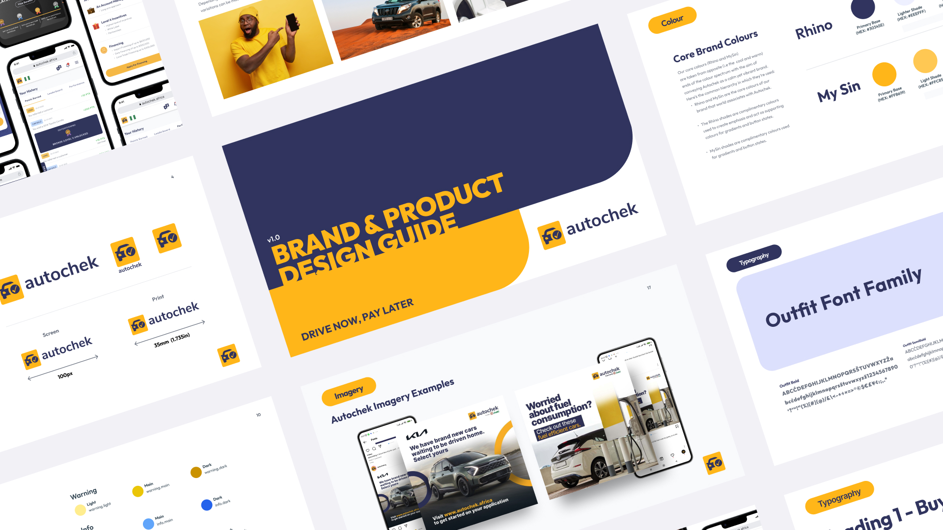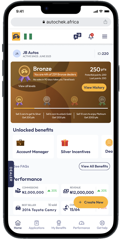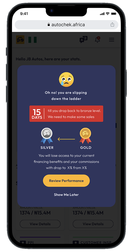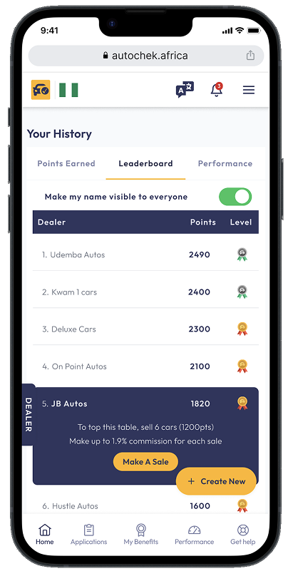

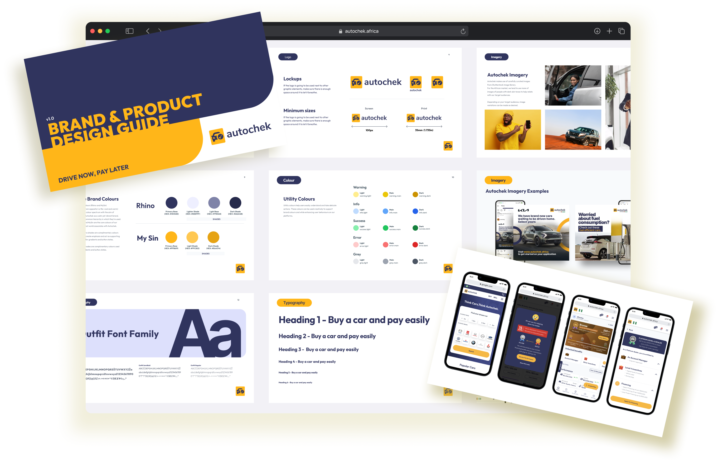
Autochek brand and product design guide with brand guidelines and mobile interfaces

Design systems & leadership · Q4 2022

Improving design consistency by 65%and cutting review time by 40% through influence, not authority

Autochek Africa

My role:Senior Product Designer

Project overview

The project at a glance.

Company context

Autochek builds products for automotive commerce across Africa. The work spanned eight products, eight markets and three acquired regional brands.

The solution

I built a shared design foundation and worked with the teams to adopt it, without reporting authority over the other designers.
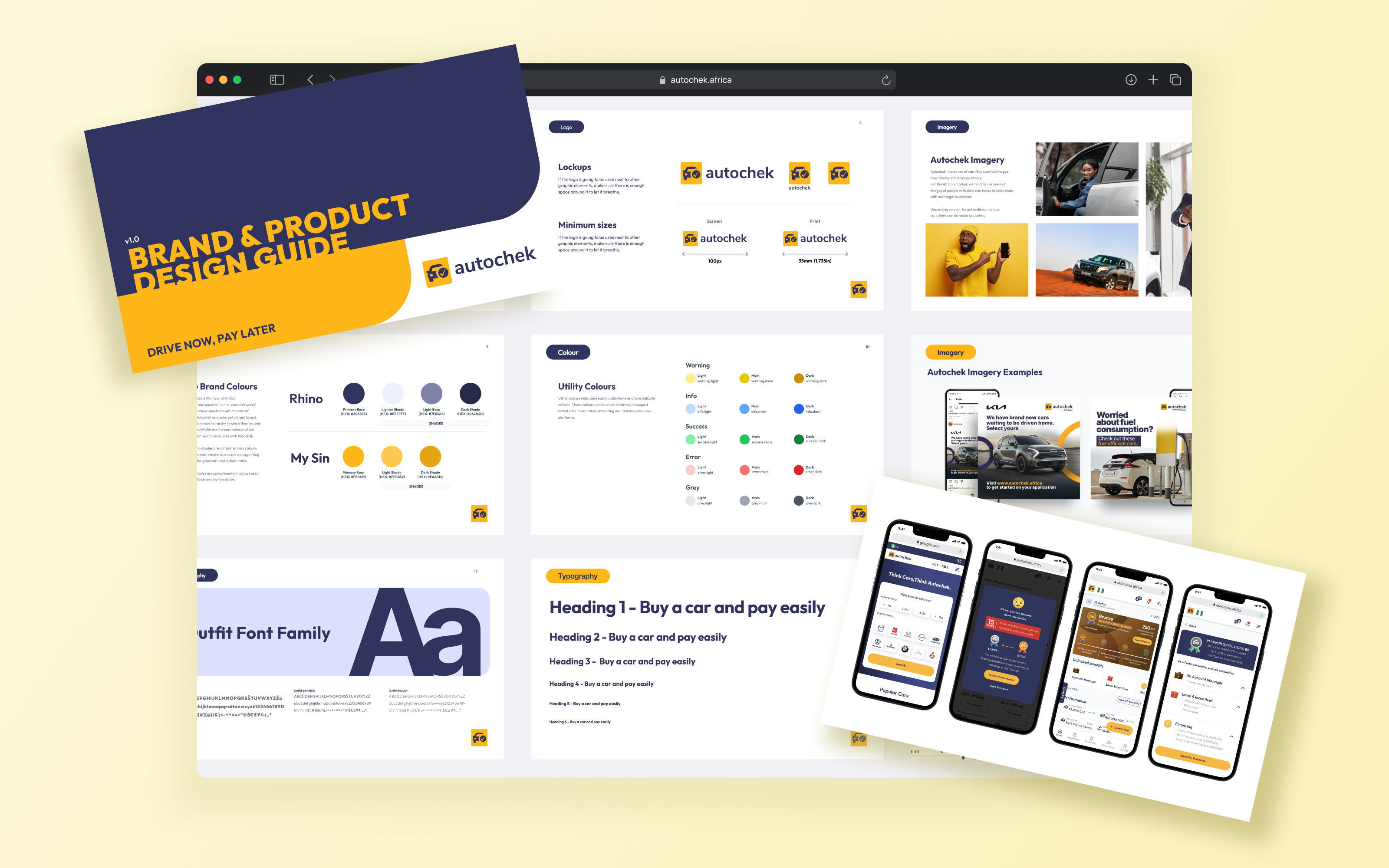
Autochek brand and product design guide with mobile interfaces on a pale yellow background
The shared brand and product design guide.
Design consistency65%

Measured through component reuse

Design review time40%

Less time to complete a review

Design adoption4 / 4

Designers using shared reviews

Newer products used the components. Migration of existing apps remained incomplete.
02 | The real challenge

Eight products. Different rules.

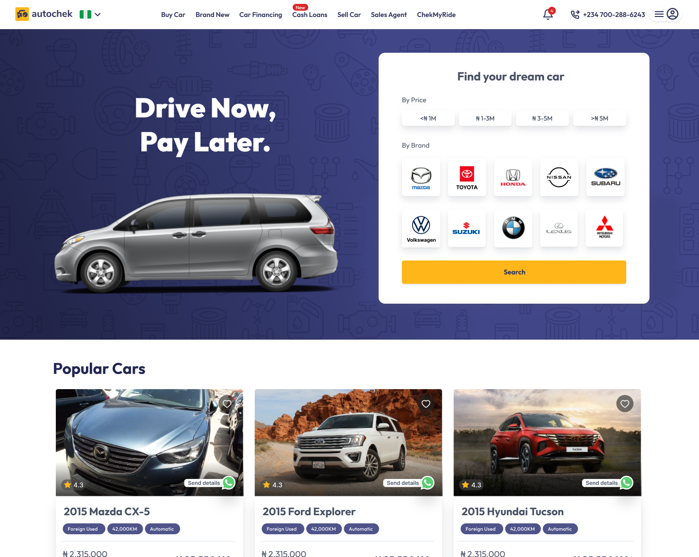
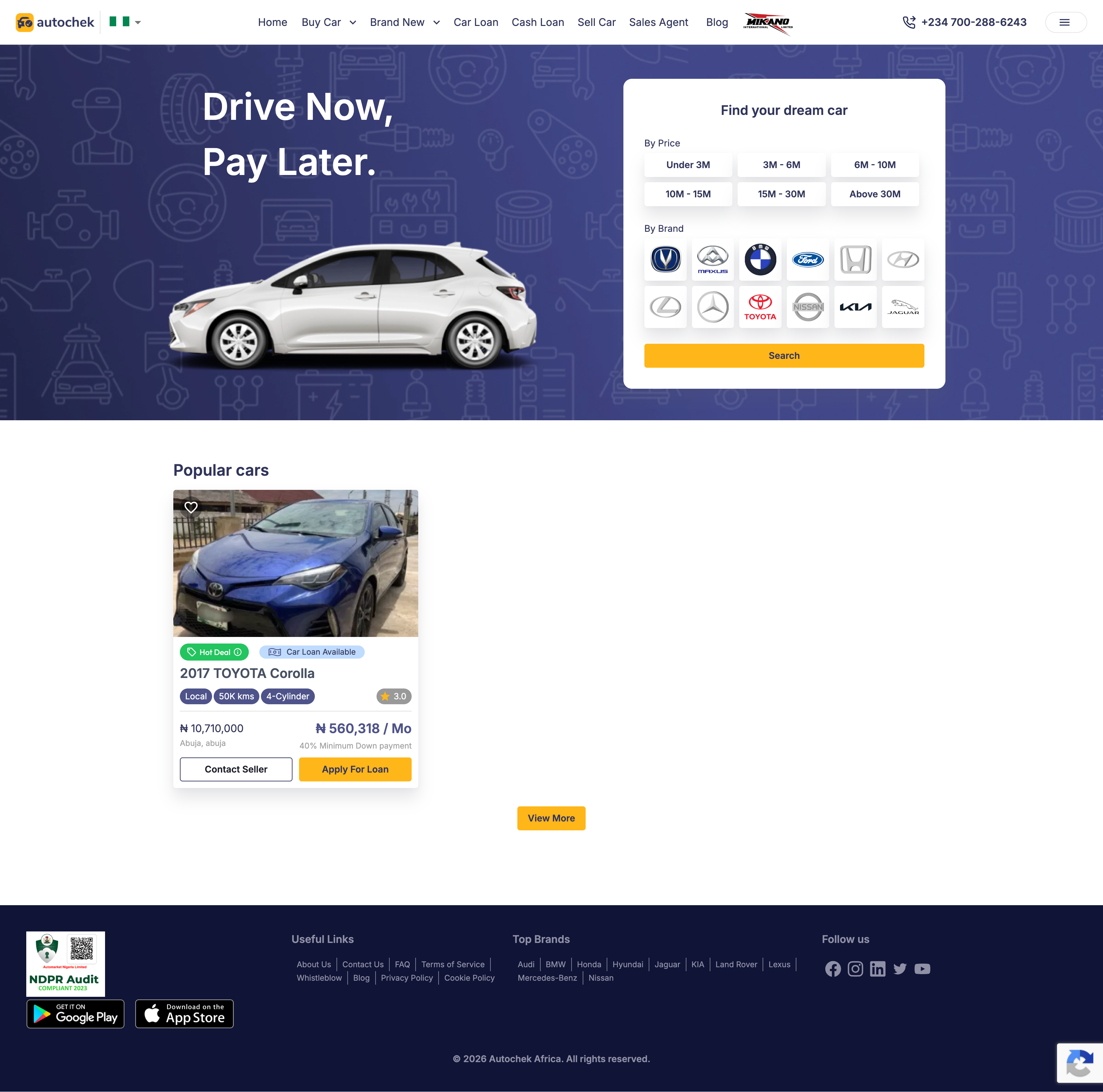
Typography, buttons and spacing varied across products. The marketplace homepage shows the gap between design and implementation.

Intended Autochek marketplace homepage design, with a bold Drive Now, Pay Later headline, four price filters and three popular car cards.
Intended design
Live Autochek marketplace homepage showing six price filters and a popular car listing.
Live product

Compare typography, spacing and button treatments. Content and viewport differ. Select either image to enlarge.

03 | Opportunity

I couldn’t mandate the change.

Where I could start

Make the
work easier.

We kept solving similar problems. Shared standards could remove some of that repeated work.

The limits of my role
01

No reporting line.

The other designers didn’t report to me.

02

No migration mandate.

I couldn’t set engineering priorities or require teams to migrate.

Adoption had to come from usefulness.

04 | Audit

Start with the repeated work.

01 / Audit lensReuse

Find repetition.

Map the components being recreated across products.

02 / Audit lensAlign

Compare behaviour.

Look at typography, interactions and component states.

03 / Audit lensAdapt

Keep useful differences.

Separate product needs from accidental variation.

05 | Adoption

Make the system worth using.

A shared habit4/4

Designers self-auditing
before reviews.

Reviews became a place to decide what to reuse, change or share.

  1. 01

    Find the existing solution.

    Have we already solved this problem in another product?

  2. 02

    Check the component fit.

    Can we use a component we already have?

  3. 03

    Question the difference.

    Does this workflow, market or user need call for something different?

  4. 04

    Share what improves it.

    Would this change help the other teams too?

06 | Shared foundation

Share the foundation. Keep the differences.

Dealer tools, inspections, marketplaces and admin products serve different needs.

Autochek guide showing typography, colour, logo and imagery specifications
The guide made shared decisions visible.
Shared foundation

Type · Space · Colour

Components, states and interaction patterns

Dealer platforms

Inspection tools

Marketplaces

Admin products

Shared foundations, with room for product-specific workflows.
07 | The implementation ceiling

New products adopted it. Migration was harder.

In newer products
1

Shared
foundation.

The dealer app and other newer products used the new design components.

Across existing apps
2

UI libraries remained.

Material UIAnt Design

Existing apps still needed migration to the new standards.

The migration gap

The time required.

Engineering assessed a full migration and couldn’t accommodate the time it would take.

08 | Changing tactics

Work with the next release.

Newer products, including the dealer app, used the new components. For existing apps, I fitted smaller UI improvements into active sprints.

I pushed for Figma Enterprise to improve design-team efficiency and track detached components. The business focused on the additional cost and didn’t see enough value to justify it.

The tooling request was declined; full migration remained beyond the engineering time available.

09 | Regional acquisitions

One foundation. Four identities.

Explore a theme
English · Nigeria
Your details
Preferences
Results view
Status
Active Pending
DateChoose a date

I managed brand themes with Tokens Studio plugin in Figma. Each market kept its own patterns, including car cards.

10 | Outcomes

More consistent designs. Faster reviews.

Design consistency65%

More consistent design.

Measured through UI component reuse. Detached or rebuilt components counted as inconsistencies.

Design review time40%

Less time to complete a review.

Compared the time to complete a design review before and after the design system was introduced.

4/4

Designers self-auditing
before reviews

8

African markets
and core product surfaces

3

Regional brands
using the foundation

The boundaryConsistency improved across design work, including the dealer app. Migration of existing apps remained incomplete.
11 | What did not work

What the system couldn’t fix.

The shared foundationDesign system
One library. Built for reuse.
Separate tooling requestFigma EnterpriseTeam efficiency & tracking detached components.Efficiency & component tracking.
12 | What I would do differently

What I’d do differently.

  1. Before the proposal

    Measure the cost.

    Baseline rework, duplicated components, QA defects and delivery delays.

  2. From the start

    Plan migration together.

    Agree on a migration scope that fits engineering capacity.

  3. When asking for investment

    Show product value.

    Connect design-team efficiency and component tracking to the product improvements they enable.

  4. After the first gains

    Return with evidence.

    Reopen declined proposals when the work produces a stronger case.

The change in approach

Make consistency a shared delivery commitment.

Up next

Designing for intent:84% increase in completed payment rate

Lenkie Technologies · Product design · 2025

Next project in 10 seconds

Lenkie bills dashboard showing the credit facility balance and invoices