

Branding · Product · 2025

Building institutional trustthrough strategic brand evolution

OPay

My role:Designer, Strategist

01 | The starting point
An independent brand exploration

Trust began with
the everyday.

After seven years using OPay, two lost cards revealed how simple banking could feel. A few taps. No branch visit. A replacement delivered within days.

My role:Designer & strategistThe scopeIdentity · Cards · Digital
7years as
a customer
The question that started it

Could the identity feel as assured as the service?
02 | The perception gap

The service felt effortless.
The identity felt restless.

As a customer and designer, I saw a gap between the experience and the way it was presented.

01

Colour at full volume

Turquoise green dominated the surfaces, leaving little room for emphasis.

02

Reassurance everywhere

Messages and exaggerated gestures competed for attention.

The opportunity

Let the capability lead.
Give the identity room to breathe.

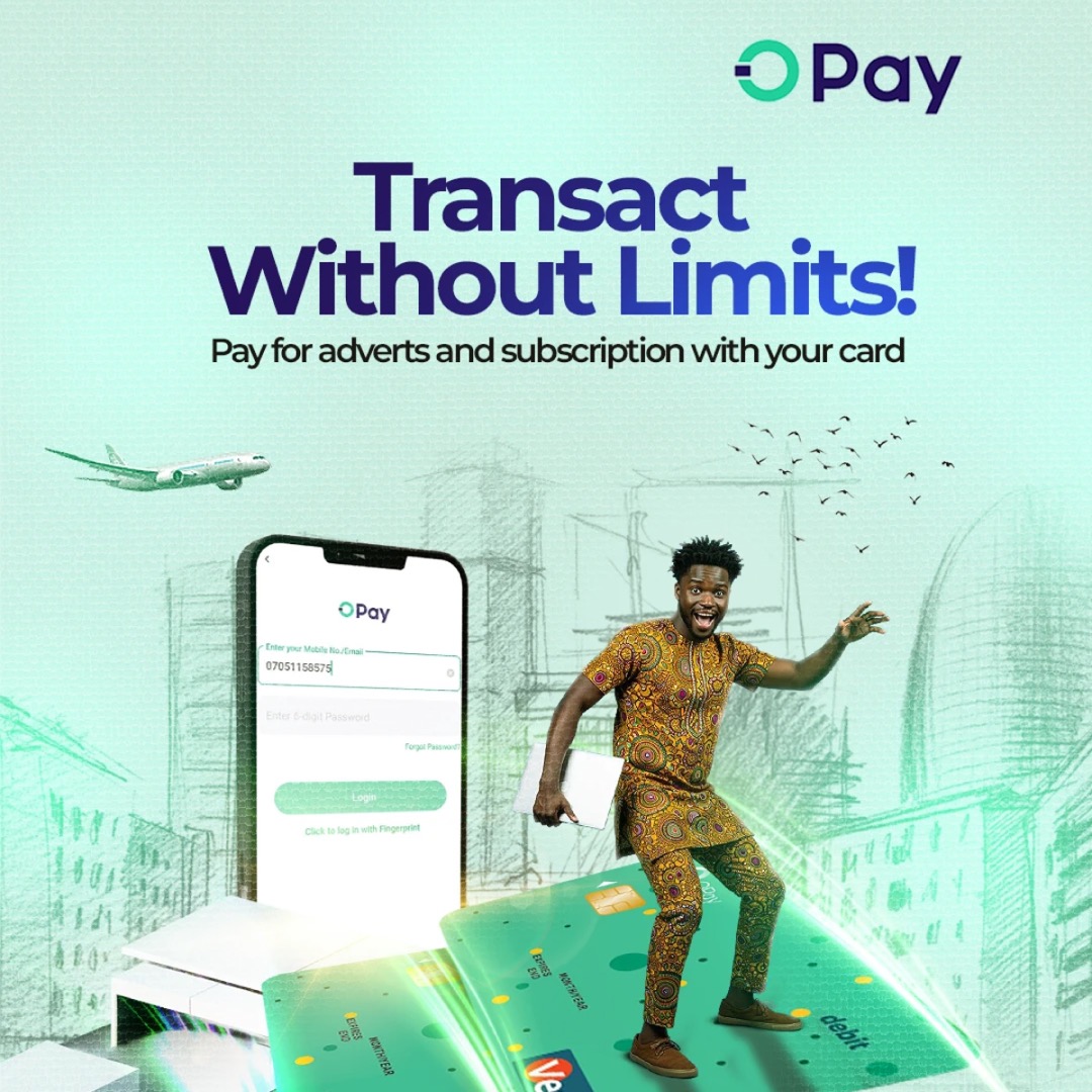
Existing campaign evidence

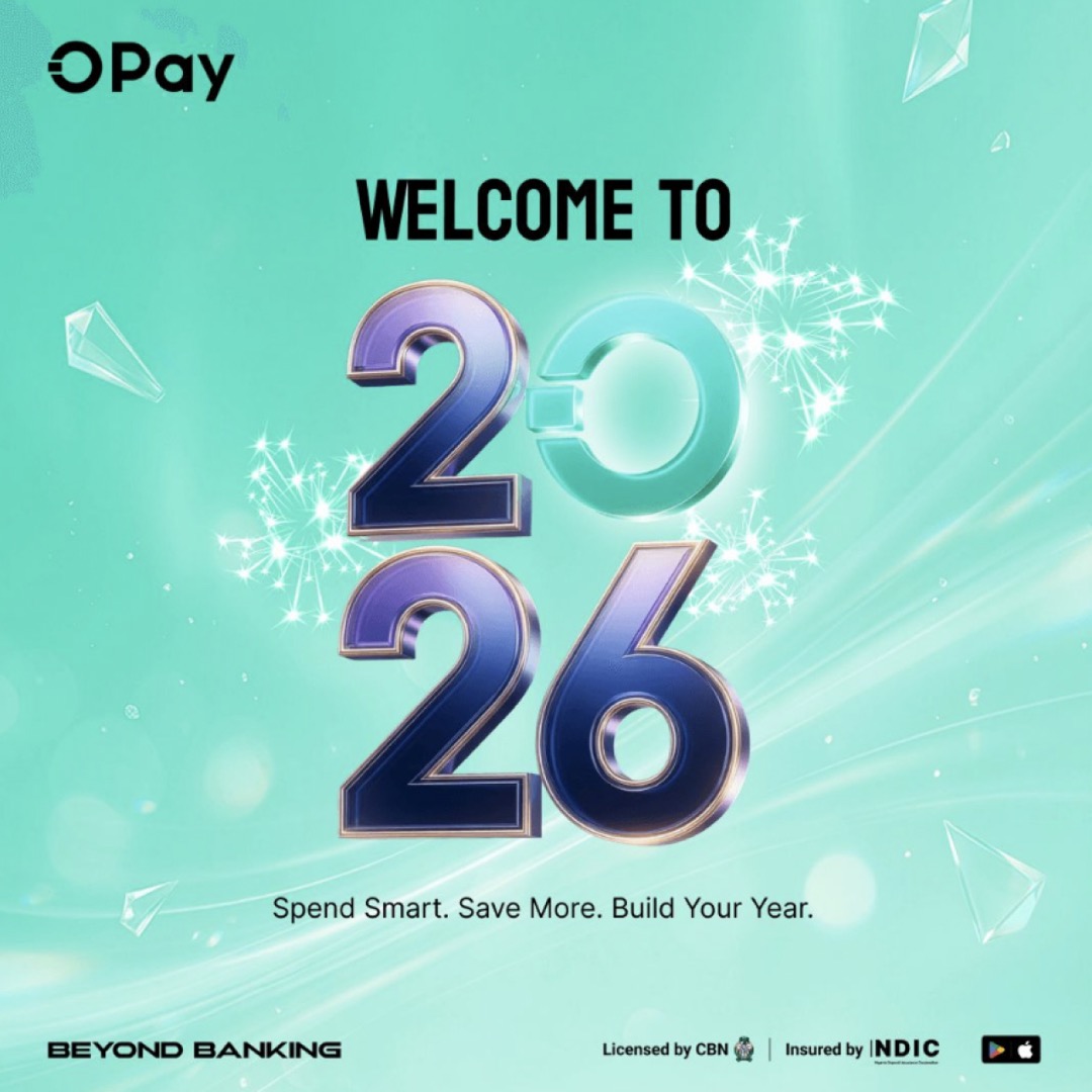
OPay’s existing campaigns — the visual language this exploration moves on from.
Select an image to view it in full.

OPay visual showing saturated green brand colour
OPay campaign creative featuring a customer, cards, and a phone interface
OPay scam alert campaign showing layered fraud-prevention features around a customer

Original campaign artwork: OPay.

03 | The design response

Evolve the
Green.
Change the impression.

I replaced OPay’s turquoise green with a green I felt was more refined and compelling.

01 / Colour

A deliberate colour shift.

Move from turquoise green to a new green, supported by deep and neutral tones.

02 / Hierarchy

One message leads.

Use scale and space to make the first read obvious.

03 / Expression

Confidence, quietly.

Let the work carry the message, with fewer competing details.

04 | Colour & character

A refined green.
A broader palette.

American Green becomes the new foundation. Aztec and Pure Linen give it depth, contrast and room.

01Refined.
American Green #42B649

A new green. A new starting point.

02Assured.
Aztec #071E1C

Depth for a quieter expression.

03Open.
Pure Linen #FEF3E3

Space for the message to lead.

05 | Type & hierarchy

A clearer voice,
at every scale.

Character in the headline. Clarity in the detail. A shared hierarchy carries the identity from a small card to the street.

Canela Deck / HeadingsClear structure.
A human inflection.
Google Sans / Body

Banking that feels clear, simple and human.

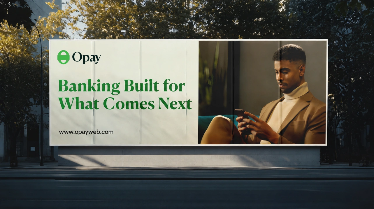
Proposed OPay billboard: Banking Built for What Comes Next, with a customer using his phone
Out in the world · Banking built for what comes next.
06 | The logo evolution

Two halves.
One connection.

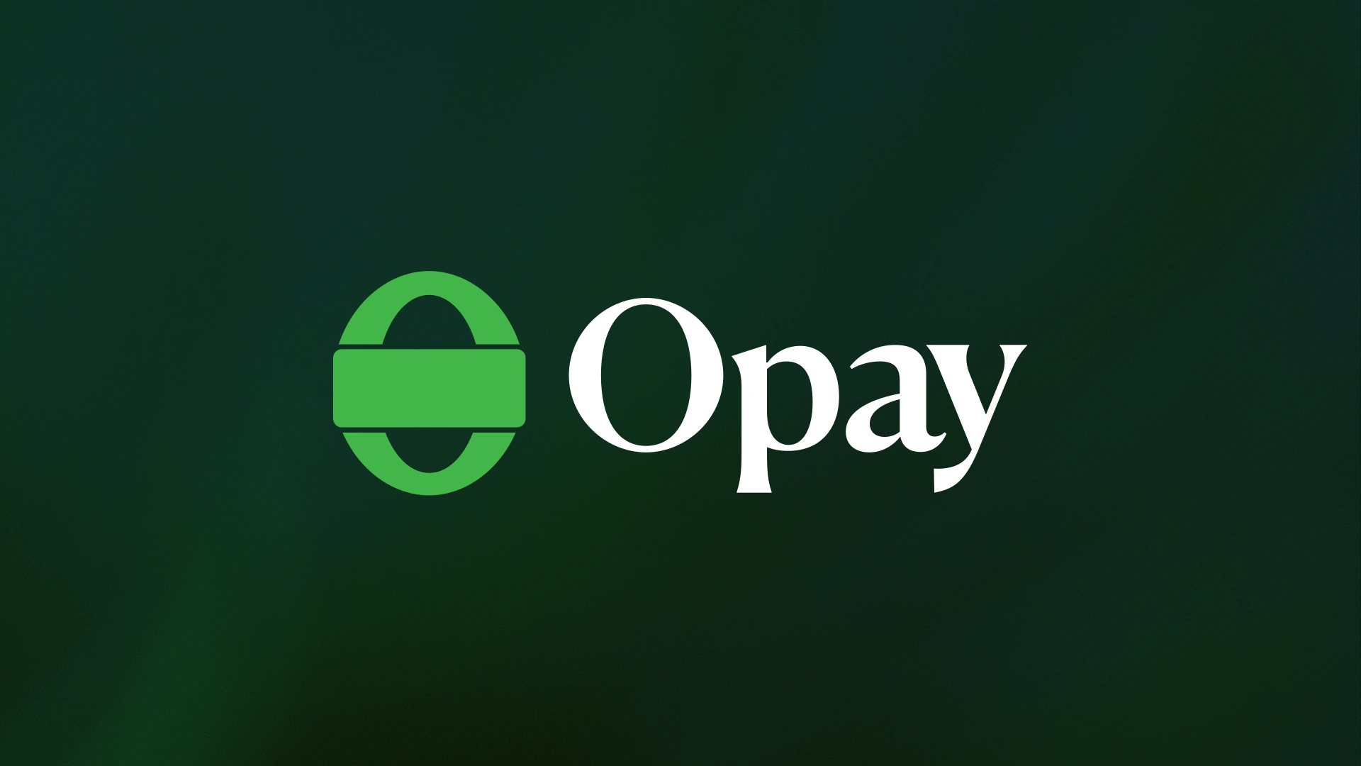
I wanted to challenge the perception that OPay belongs only to lower- and middle-income customers. The new mark brings them and high-net-worth individuals into one shared identity.

Proposed identity
The origin

OPay’s loop stood for continuous service; its square represented the debit card. 2023 logo story ↗

The two halves

Lower- and middle-income customers and high-net-worth individuals, given equal presence in the same symbol.

The connection

The debit-card bar bridges both halves: a shared experience rooted in OPay’s commitment to financial inclusion ↗.

07 | The campaign direction

A new voice for
everyday banking.

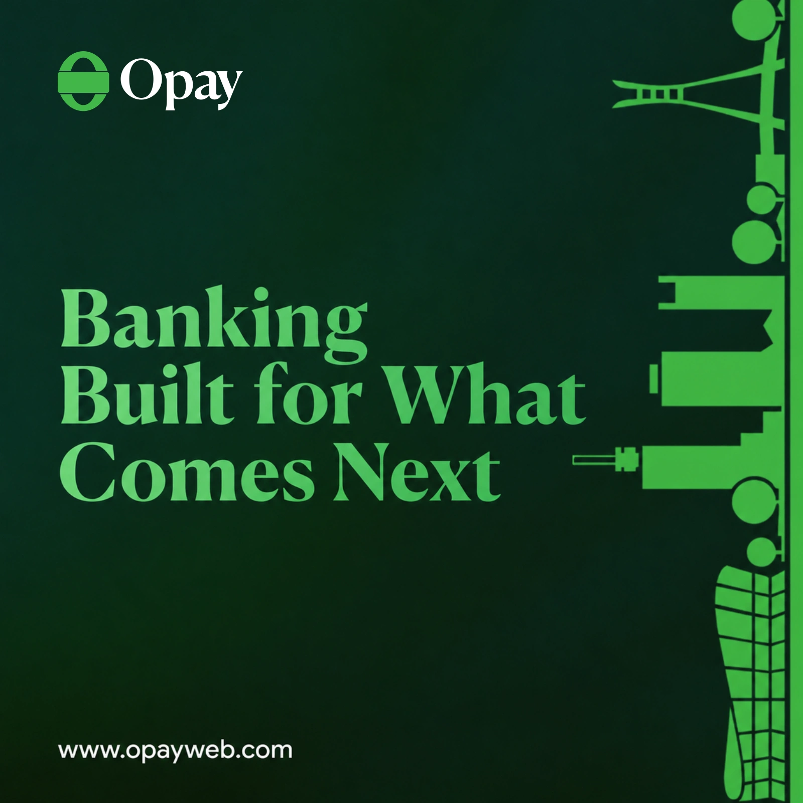
A shared type system, recognisable city silhouettes and a more deliberate use of green connect the brand promise to everyday benefits.

Proposed OPay campaign: Banking Built for What Comes Next, with green city silhouettes on a deep green background
The brand promise
Proposed OPay campaign: Earn as you Shop, promoting rewards on debit-card transactions against a light background
Everyday rewards
08 | The identity in motion

One identity.
Many expressions.

OPay brand montage bringing together the logo, campaign typography, cards, colour palette and mobile experience
The identity in motion · 10 seconds
09 | The reflection
What I took away

A moreassured identity.A question still to test.

The design lesson

A more assured identity can still be inclusive. The two halves and debit-card bridge gave that ambition a form, with colour and typography carrying it across the system.

The next question

Would this direction feel credible to high-net-worth individuals while remaining familiar to lower- and middle-income customers? That needs research across both groups.

Independent proposal.
Not commissioned or launched by OPay.

Up next

Improving design consistency by 65%and cutting review time by 40% through influence, not authority

Autochek Africa · Design systems & leadership · Q4 2022

Next project in 10 seconds

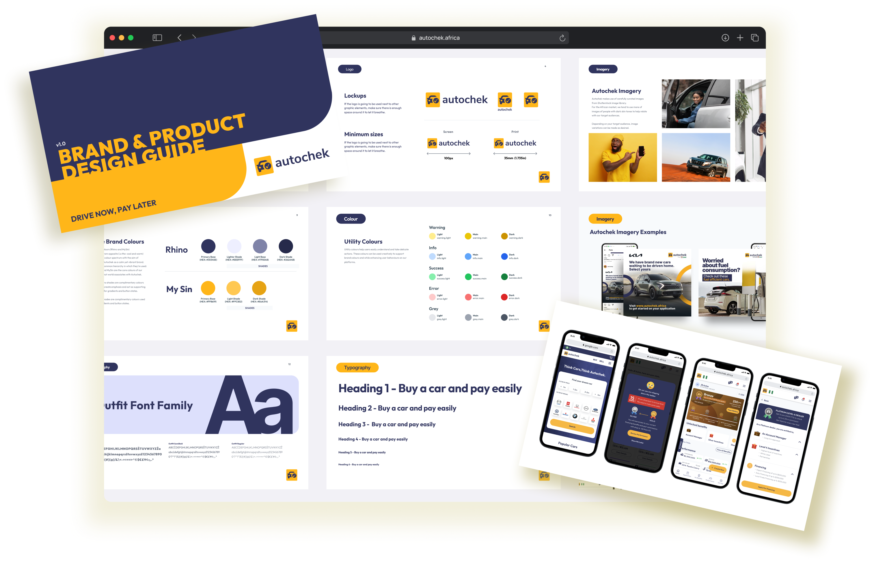
Autochek brand and product design guide with brand guidelines and mobile interfaces